The objective of the playing cards design is to increase awareness of Weston Co. brand and deepen the loyalty of existing customers.
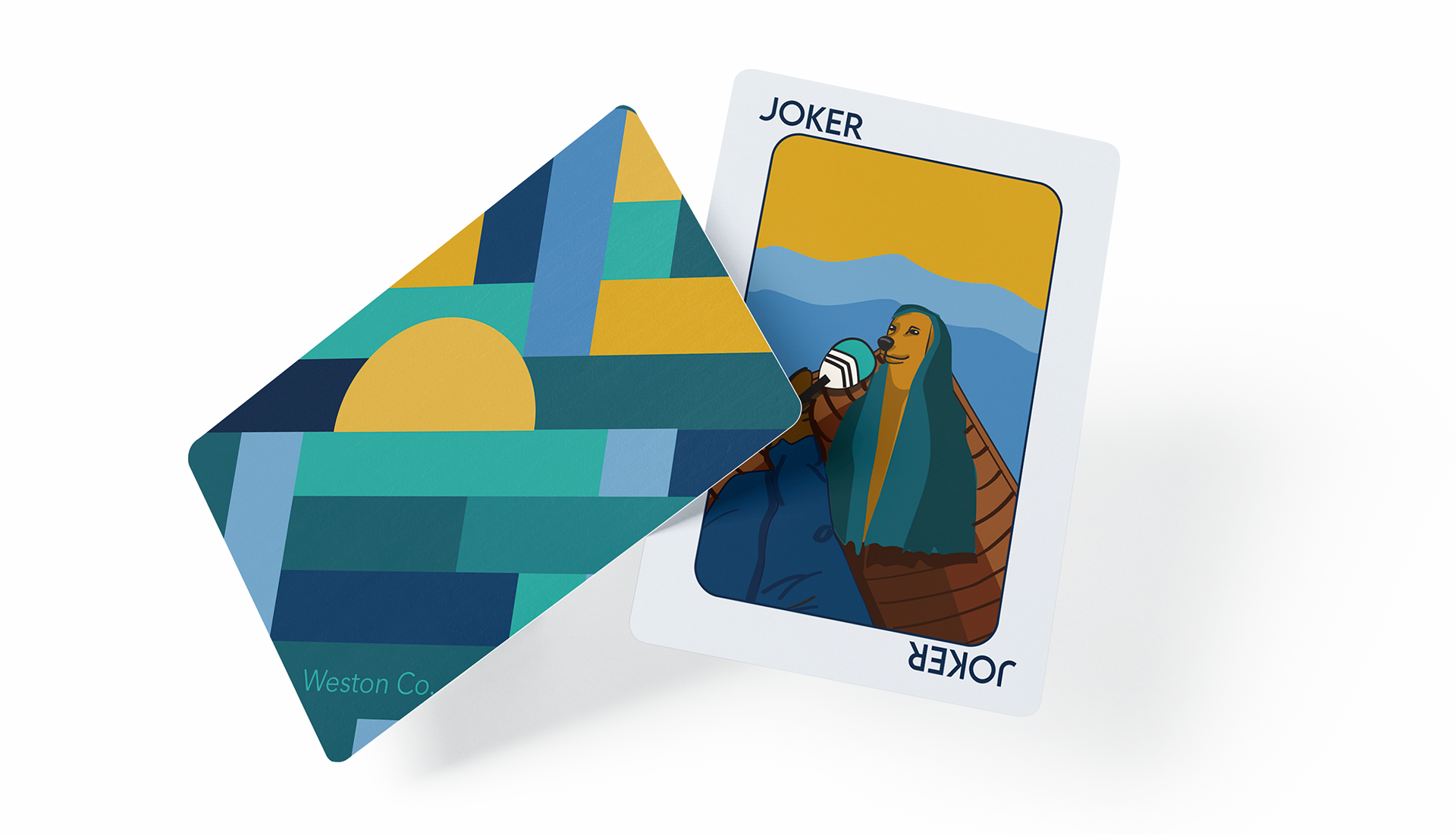
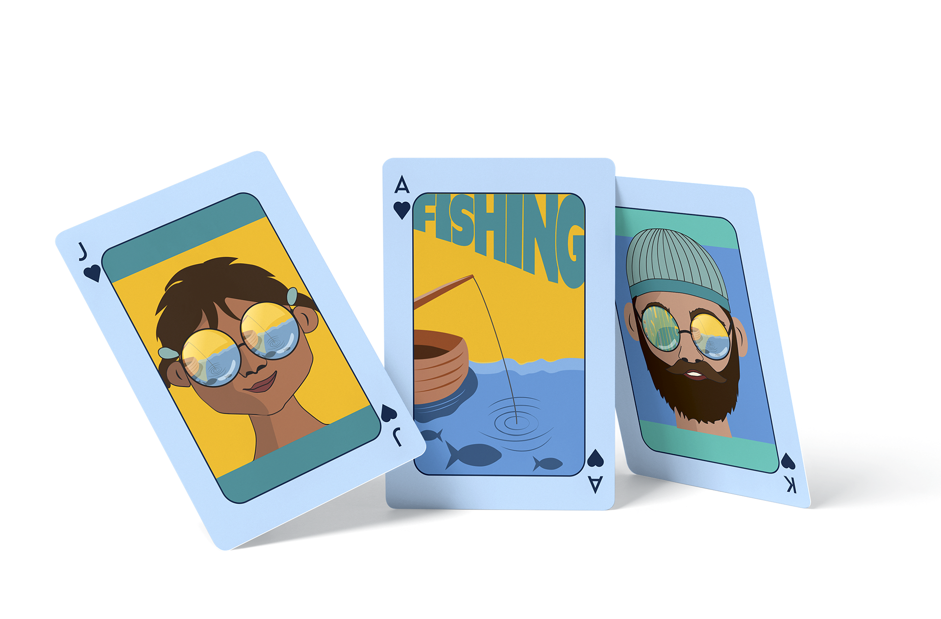
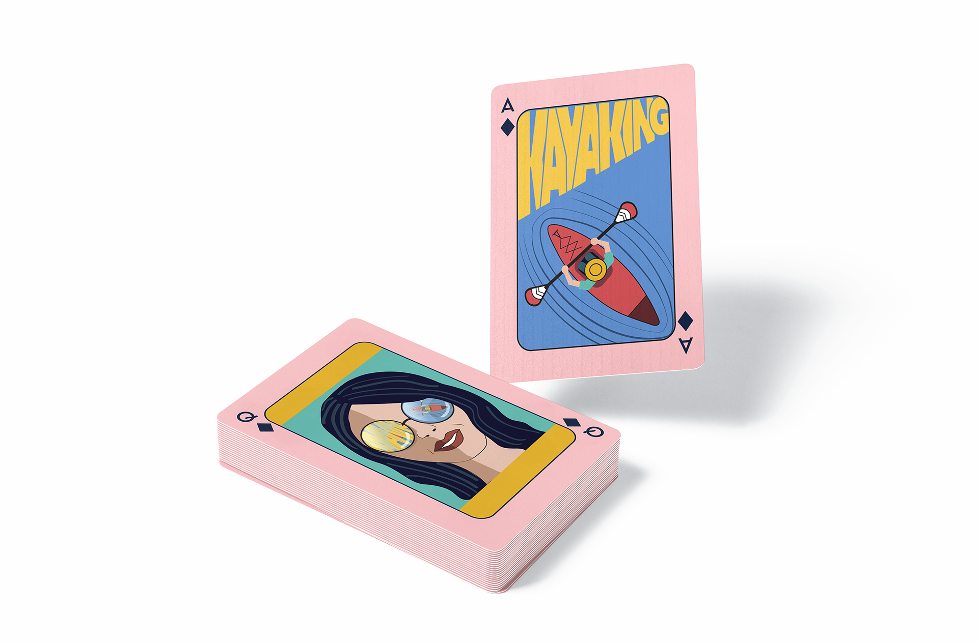
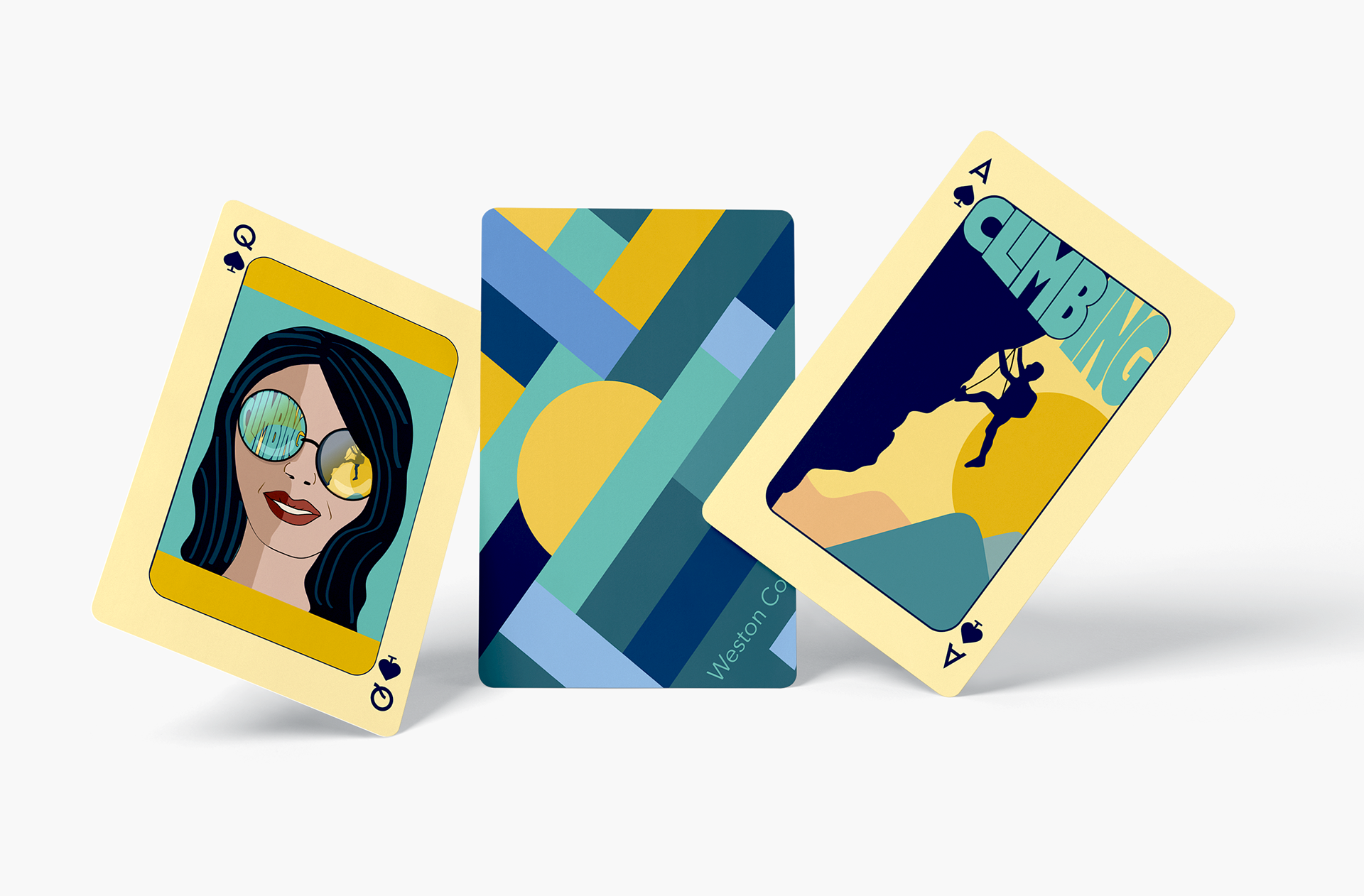
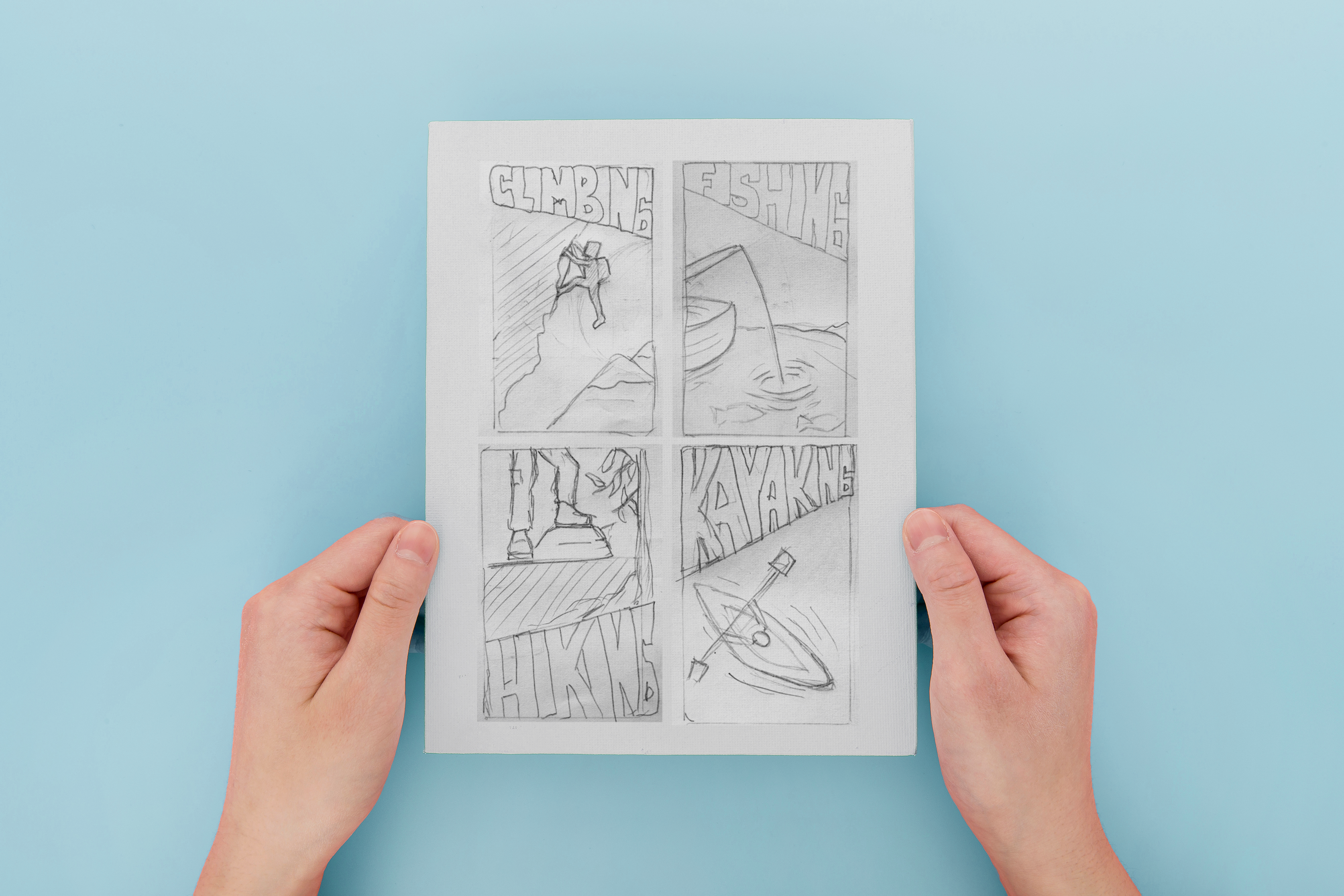
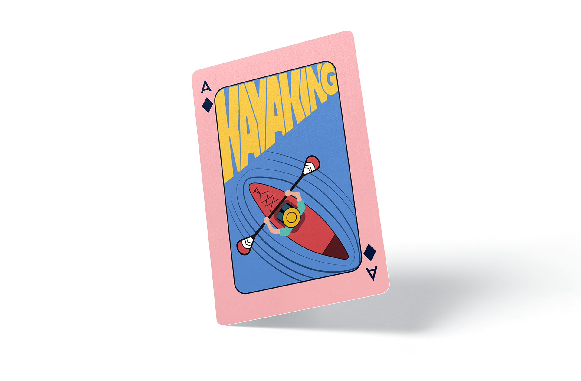
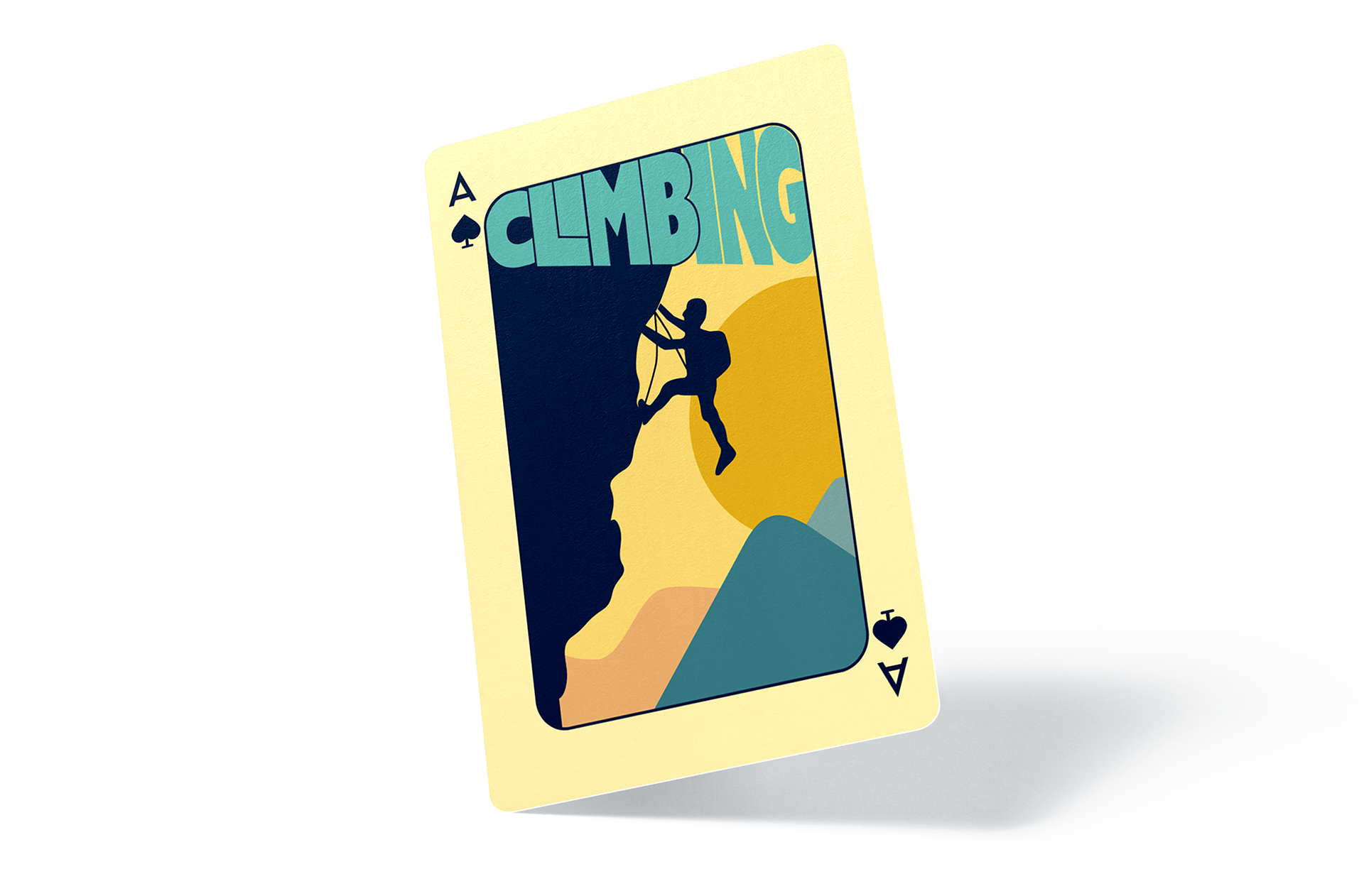
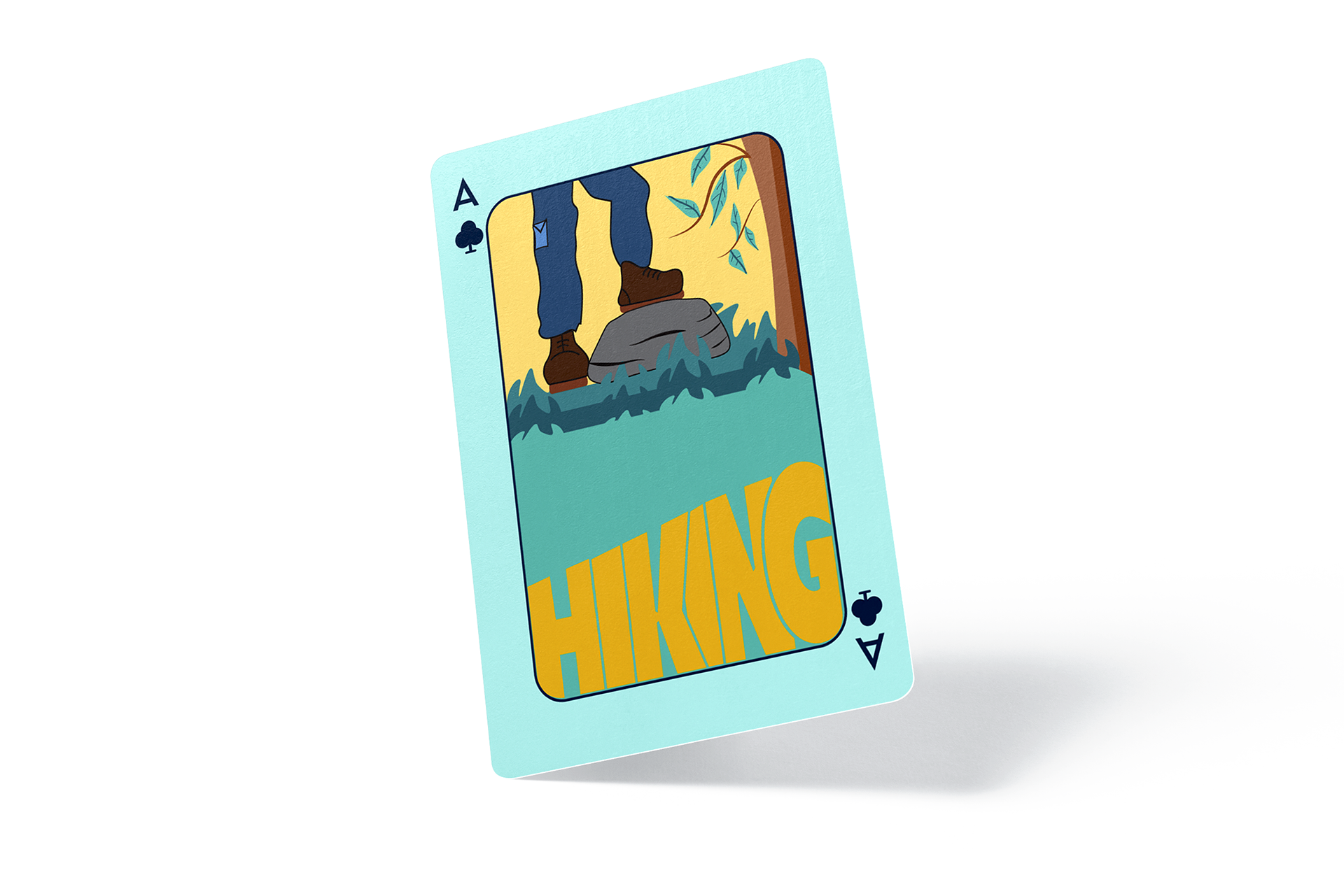
The cards were to be distinctive and look professionally designed. They also need to promote a sense of adventure and showcase the Australian great outdoors. I created a deck of playing cards by including a series of illustrations, each representing a sport Weston Co. provides products for (kayaking, fishing, hiking, climbing).
The cards were to be distinctive and look professionally designed. They also need to promote a sense of adventure and showcase the Australian great outdoors. I created a deck of playing cards by including a series of illustrations, each representing a sport Weston Co. provides products for (kayaking, fishing, hiking, climbing).
SKETCHES
COLOURS
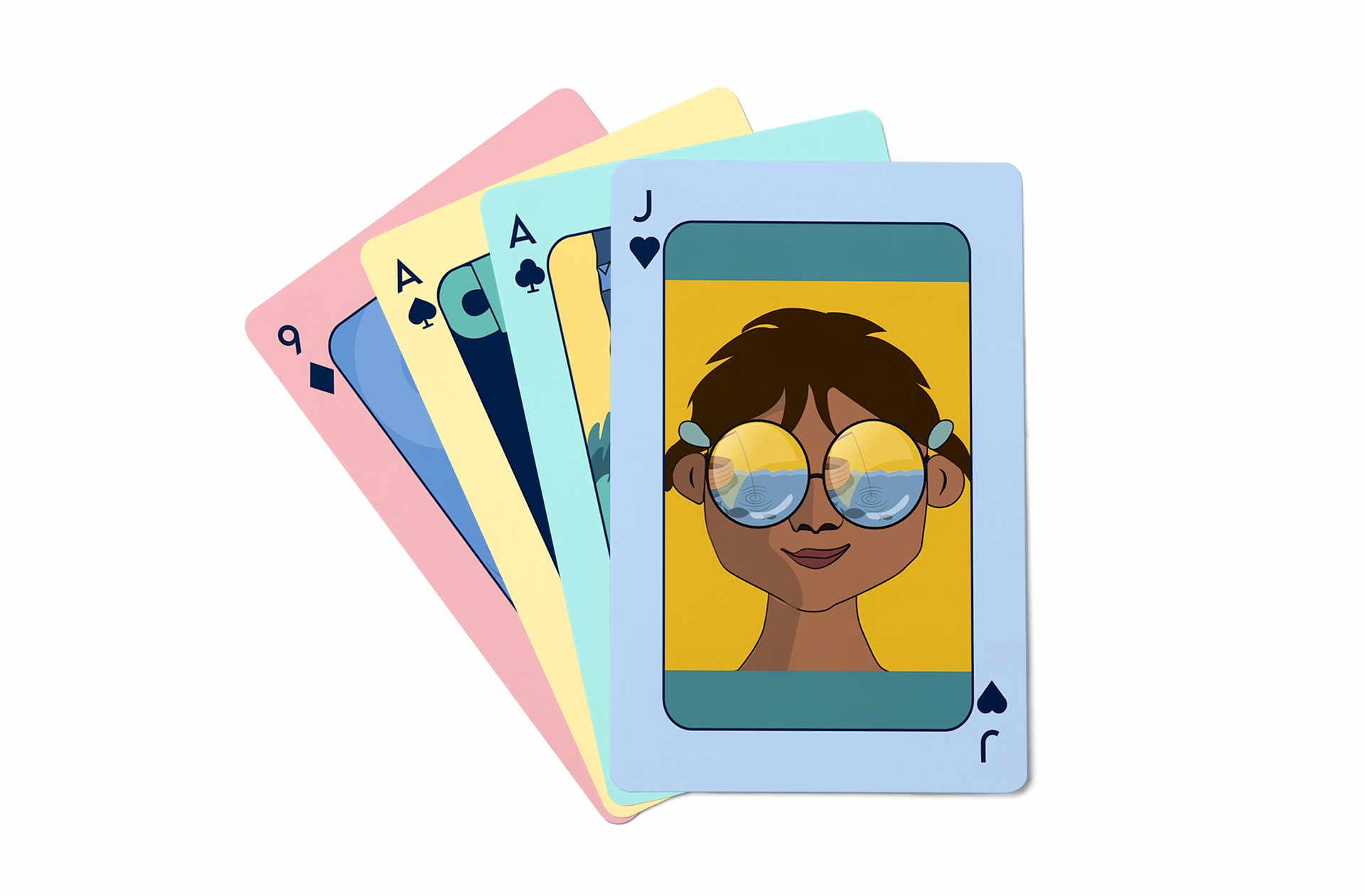
The client suggested a range of colours that work perfectly with my concept. I wanted to work with the idea of outdoor sports and practices like fishing, hiking, climbing, and kayaking. I add a few colous to the designs to define each suit with its colour.
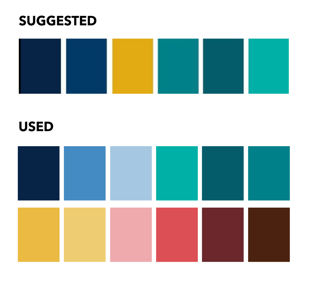
The concept is outdoor sports or practices like fishing, hiking, climbing, and kayaking. They are created as minimalistic flat illustrations. the idea of the designs is to be simple and that the colours expressed every aspect of the design. Each suit has its own colour and design with the topic of one of the sports, but they are all connected by having a similar style and similar colours in the design.

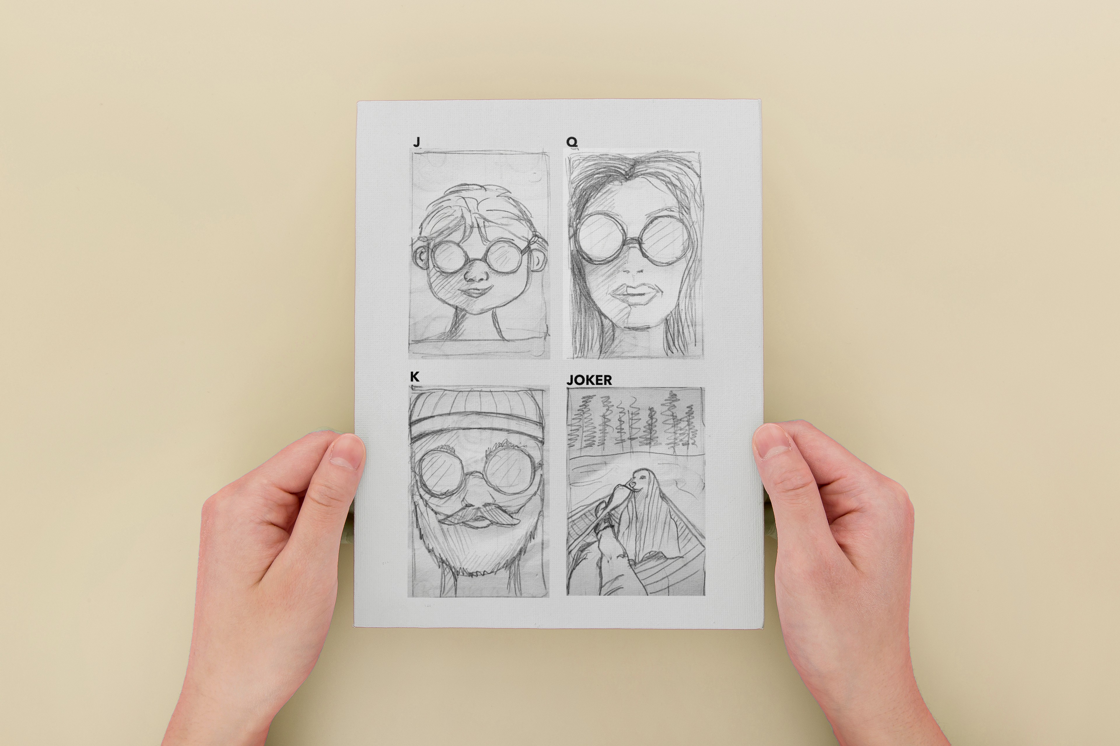
The J, Q, K, and Joker include the concept of a family. The client was looking that the designs to be created by having in mind that the customers were predominantly men and family orientated, with many customers having kids and/or grandkids. Each of the cards represents what could be a member of the family. They all have glasses where the images of all the rest of the cards are reflected. The Joker represents the family dog in an outdoor environment.