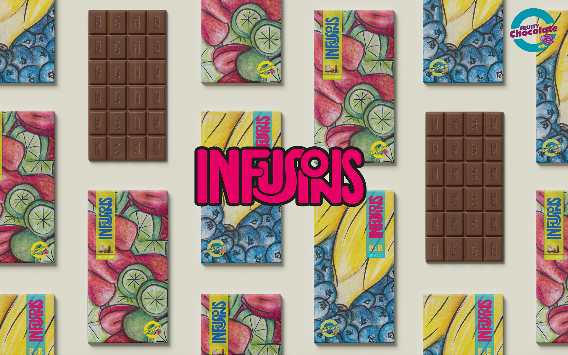
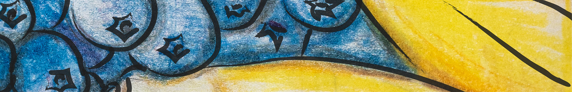
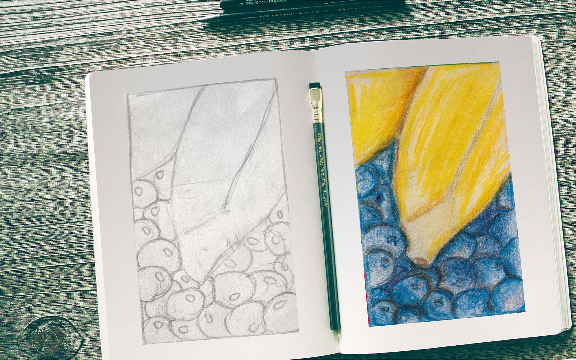
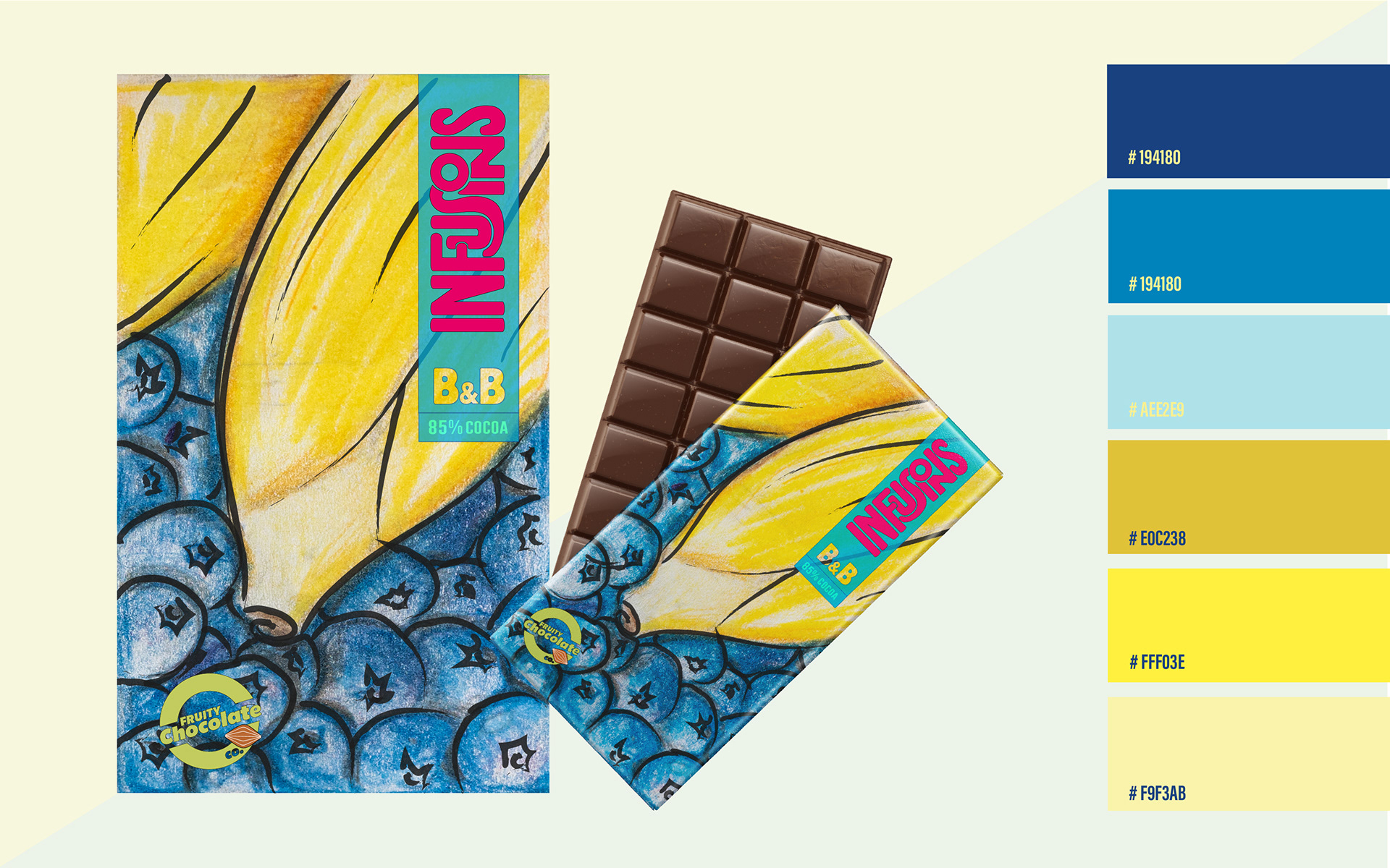
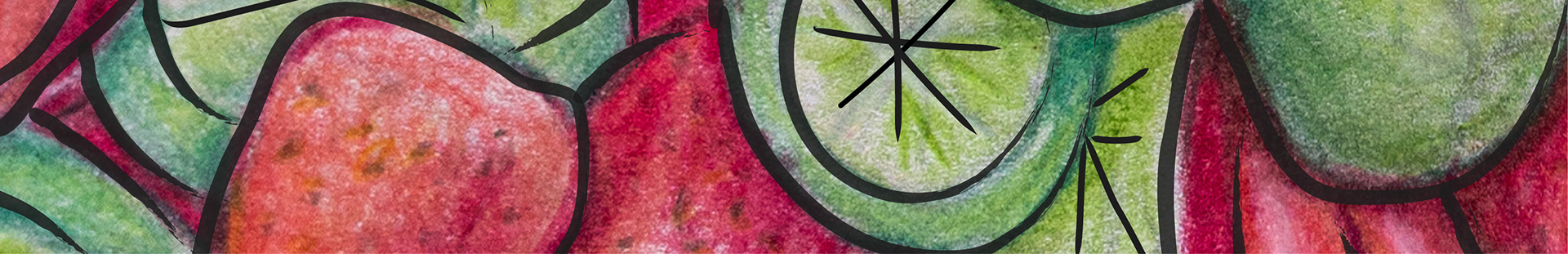
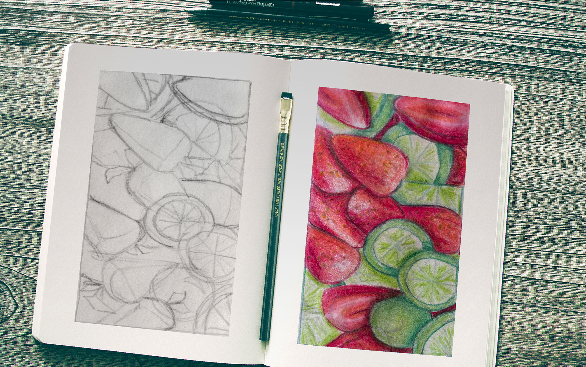
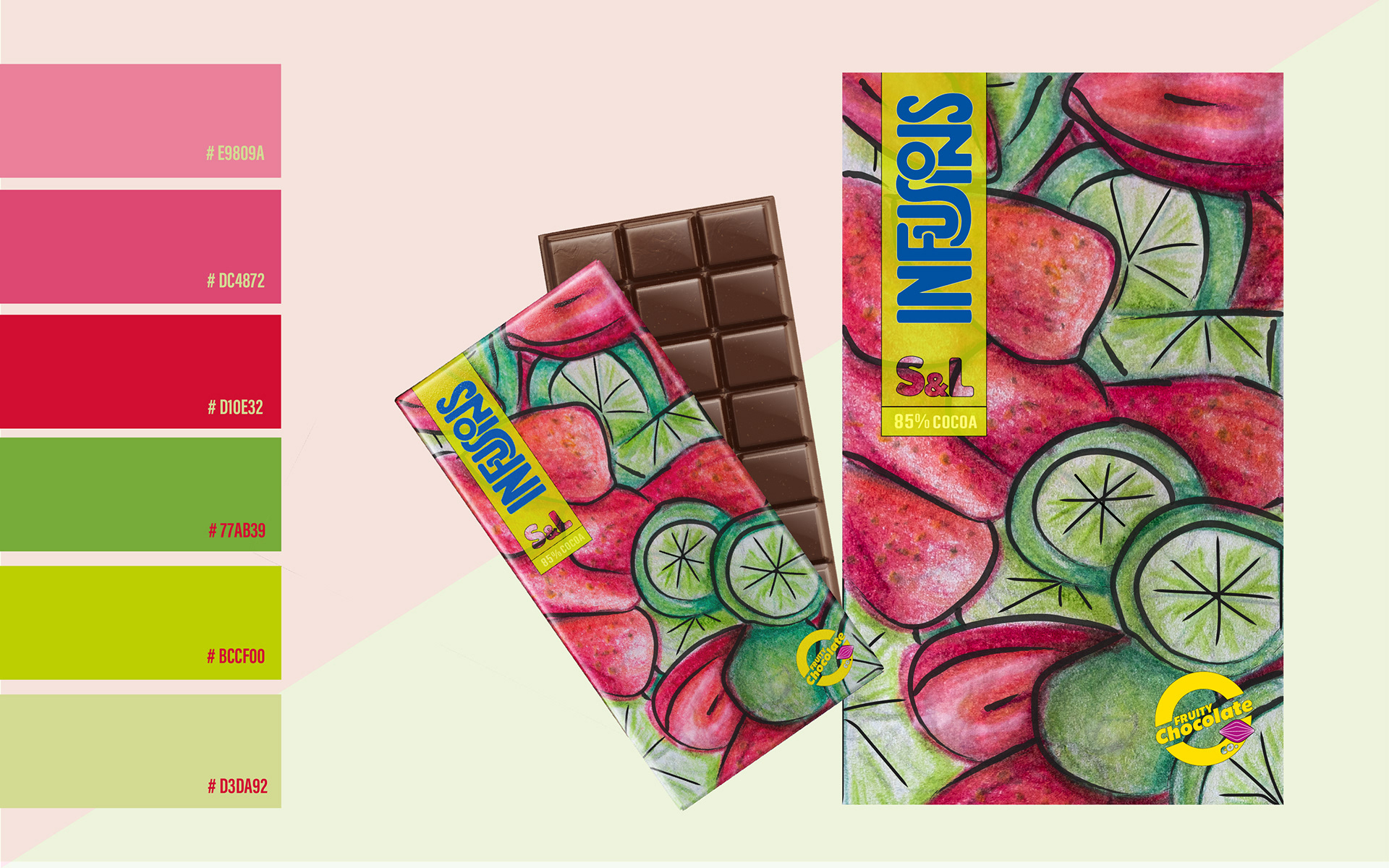
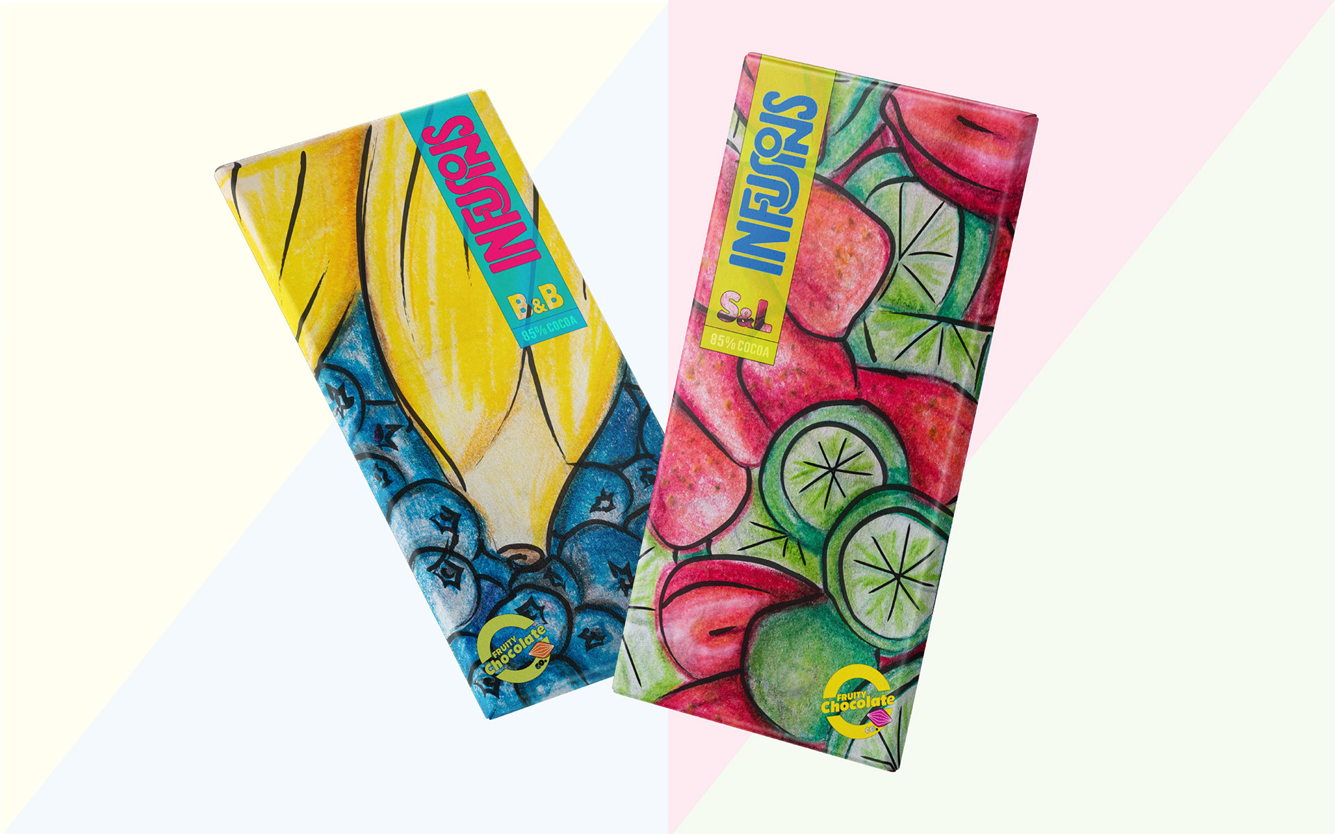
INFUSIONS Logo/package
Fruity Chocolate Co. BRAND LOGO / PACKAGES Fruity Chocolate Co, a company that produces a range of handcrafted, fruit-flavored chocolates, wants to release a new brand called INFUSIONS, a delicious and surprising chocolate combination of fruity flavours. The task was to create the INFUSIONS logo, and the packages for the flavours are Strawberry & Lime (S&L) and Banana & Blueberry (B&B). They had to be unique and visually different from other chocolate brands, and they should be bold, fun, and playful. I started by creating the typography that I wanted to use in the INFUSIONS logo. Infusion is a synonym of the word mixture, so I wanted to create a typography that allowed me to play with the letter and unusually mix them. I sketched some ideas of the style thinking of the premises that it had to be bold and fun. For the packages, I designed a few handmade illustrations, which represented the flavour and the fruits. By using a pencil and colour pencil, I drafted the patterns of the packages giving them a modern and honest style.